Book covers have always been something that fascinated me. I remember studying the covers of my favorite books as a kid, trying to decide if I agreed with how the artist portrayed a certain character or scene. Usually, I found myself slightly disappointed in the illustration, because, of course, my mind had conjured up something completely different. But as I got older, I began to realize that THAT was the point of books. To allow everyone’s imagination to create their own unique version of the story for them and them alone. The cover was there as a first impression, a colorful lure to draw you into a story that would, hopefully, take your breath away.
So imagine what it was like for me to have someone illustrating my cover. Suddenly, the characters that had been nothing but figments of my imagination for years, were going to come to life with the help of pen and ink. And to be honest, I struggled with it a bit. For one thing, when I originally wrote Edge of Extinction, it was a young adult novel. Even after I went through the countless edits to transform it into a middle grade novel, I still had a young adult cover in my head. And for those of you versed in the differences between a middle grade novel and a young adult novel, you know the covers are VERY different. Young adult covers tend to be more realistic or symbolic, think the hand and apple on the cover of Stephanie Meye’s Twilight or the sword on the cover of Kristen Cashore’s Gracling. Middle grade is a whole different ball game. The covers usually show action scenes with lots of characters, usually depicted in a more animated fashion. Picture the cover for the very first Harry Potter book. I had a hard time wrapping my mind around an animated cover. For one thing, the story line of Edge of Extinction is fast paced and high action, and I had this fear of someone turning my terrifying dinosaurs into something that resembled Barney’s cousin. Thankfully, that didn’t happen.
My fabulous team at HarperCollins in all their infinite wisdom tapped an artist named Eric Deschamps to illustrate not only the cover but also the images that would eventually go inside the book. Of course, I immediately went online to stalk poor Eric to find out everything I could about him. For those of you interested in doing the same, his website is here. What I found made me a VERY happy camper. He is crazy talented, and after a fair amount of snooping, I was confident that he wouldn’t make the dinosaurs too “cute.” A few weeks later. I got the first sketch for the cover.

When it hit my inbox, I stared at it for a long time. I liked it, but I didn’t love it. For one, I didn’t like the use of the T. rex. No offense to the king of the dinosaurs, but I felt he was a little over done on the cover of books. If you go to Amazon and search dinosaur books, nine times out of ten, you will see this guy featured. And although he does make an appearance in Edge of Extinction, I felt he was overdone. Lets call him the Kim Kardashian of dinosaurs, shall we? Pretty to look at, but we’re all kind of sick of seeing him.
I also didn’t love the kid’s outfits. They were meant to depict the camouflage body armor worn by Sky and Shawn, but the illustration made it way to high tec. Also,Todd never would have worn it. I sent back my comments, worried that I was going to be told that I was a first time author and should just be grateful to have a cover I didn’t have to draw myself with a box of crayons. To my infinite relief, that didn’t happen. Instead, they took all my suggestions to heart, and a few weeks later, I received this beauty in my inbox.
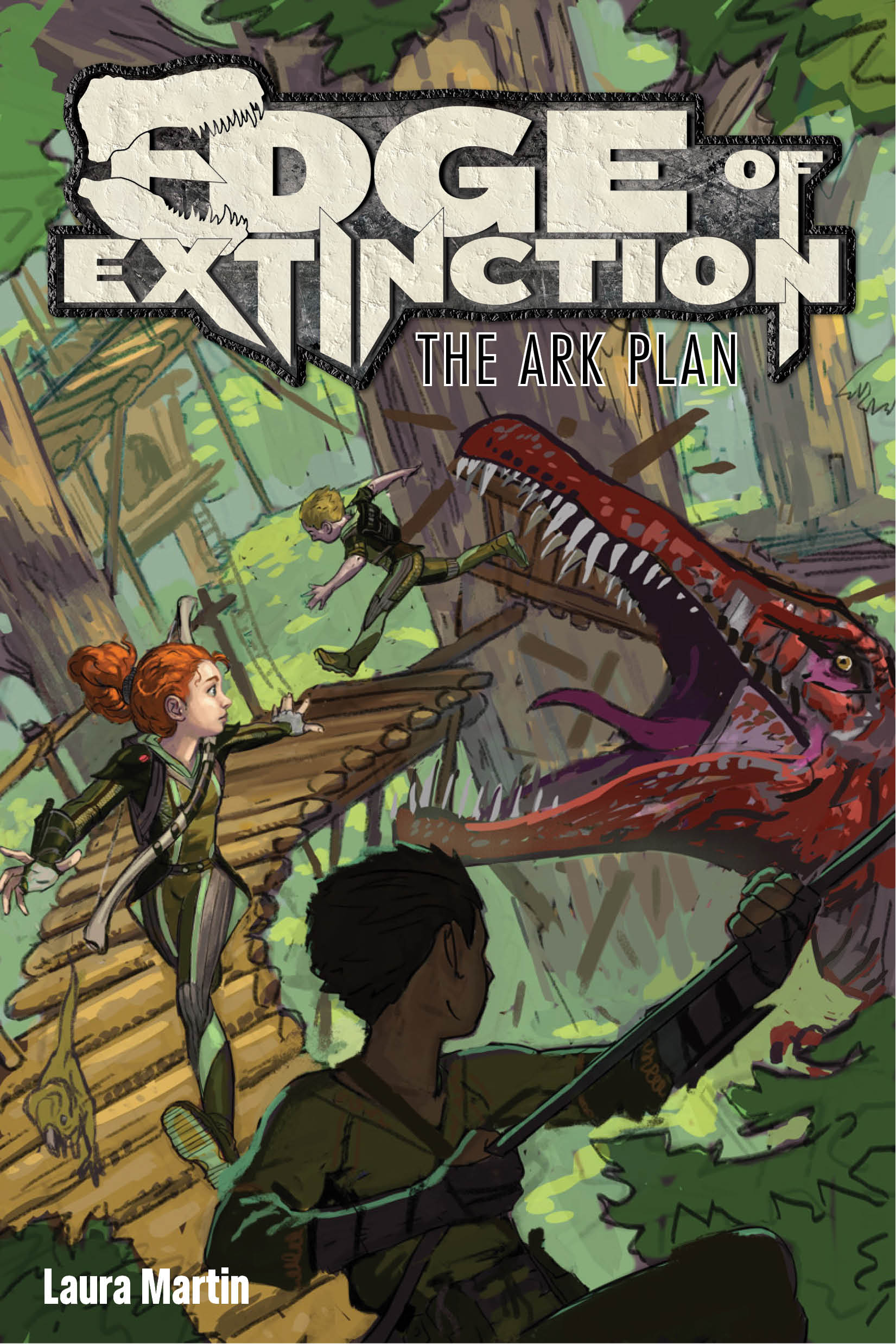
Much better! All my suggestions had been implemented. From changing the look of Sky’s bow to adding Verde, Todd’s dinosaur companion, onto the bridge. And the biggest change, swapping out the T. rex for the equally terrifying Spinosaurus. Not familiar with that the Spinosaurus? You should be. He gave the T. rex a run for his money in the terrifying department. Check out this article for a few facts about this guy. I sent back my thoughts, and a few weeks later, the finished product landed in my inbox. So here my friends, in all it’s glory, is the official cover for Edge of Extinction-The Ark Plan.

Pretty amazing isn’t it? I thought so too. There was a happy dance performed. It was rather impressive. What I lack in talent, I make up for in enthusiasm. That should actually be my mantra in life. But back to the fabulous cover. Eric did unbelievable work, and I still can’t believe how well everything turned out. One more time, for those of you who liked those “Find the Six Things that are Different In the Second Picture” puzzles as a kid.
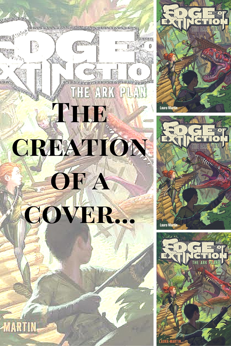
So there you have it. The evolution of my cover. What do you think?


How fascinating?! I had no clue this was the process of getting a cover. And it looks absolutely amazing!!! As for your first blog post, bravo!! Well done! It’s honest and witty! So excited to read more of your work! I’m so proud of you. (Used a period their because I’ve already used waaaayyy too many exclamation points in this…so excited!!!).
LikeLike
It’s great to read about the process of a cover from an author’s perspective. The cover turned out amazing! I’m sure it will grab a lot of attention on store shelves!
LikeLike
All of Eric’s work is truly amazing. You are lucky to have connected with him.
LikeLike
Pingback: Here Comes The Hardcover! | lauramartinbooks
Pingback: Code Name Flood-Cover Reveal | lauramartinbooks